RBA charts show overall we're not too badly off
The RBA has issued a series of charts that give insight into the Australian housing market.
The housing loans approvals chart indicates just how subdued the first-home buyers’ market has been ever since the end of the bonus boost that followed the global financial crisis.
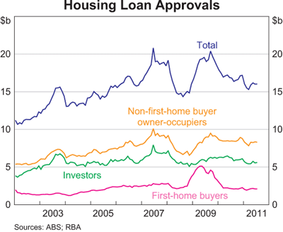
Investors don’t have much presence either.
The number of home upgraders didn’t slip as much as other market segments after the GFC, and appear to be keeping the listings ticking over with purchasers.
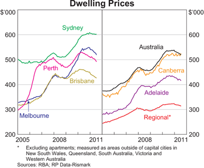
The next chart indicates how all the capital cities prices have eased over recent times, although Sydney and Canberra have been the most resilient.
The next chart shows our net worth including dwellings, financial assets and liabilities.
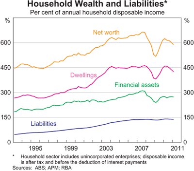
The elephant in the room is household indebtedness.
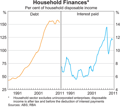
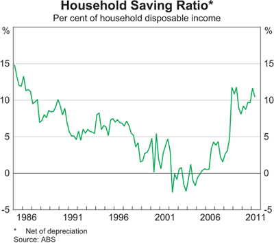
But we have been recently shown as capable of saving more.
Taking the five charts into account, overall you’d have to conclude we aren’t too badly off.
The full set of RBA charts is available on the RBA's website.